A durable record, not a trophy shelf
Each cycle publishes a searchable archive of shortlisted work with jury notes, category rationale and credits. It is meant to be read years later, not just the week the results land.
About the program
Interawards runs once a year and leaves something behind each time: a searchable archive of shortlisted work, jury notes, category rationale and credits. Nothing about that record is decorative. It is the reason studios in Buenos Aires, Santo Domingo and elsewhere keep entering.
Independent studios, in-house teams and students all submit through the same route. No separate track, no gated tier — the difference shows up in the work, not the paperwork.
A technical check covers file specs, category fit and rights clearance. Only then does the rotating jury score the work. The order matters — it keeps the comparison honest across graphic design, packaging, motion, type design and digital craft.
Warm off-white paper tones, ink black, one signal orange, a generous grid, work photographed straight-on, and a grotesque sans paired with a quiet serif for captions. The look is not a skin over a submission form; it is how the program reads its own material.
A searchable shortlist archive with jury notes and credits, a calendar of deadlines, and a small printed annual. Over several cycles that becomes a submission record you can compare against — useful when you want to see where your own work sits.
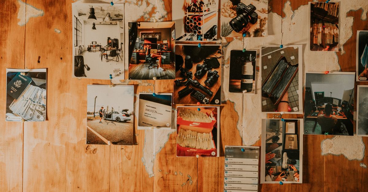
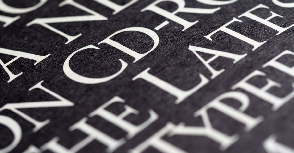
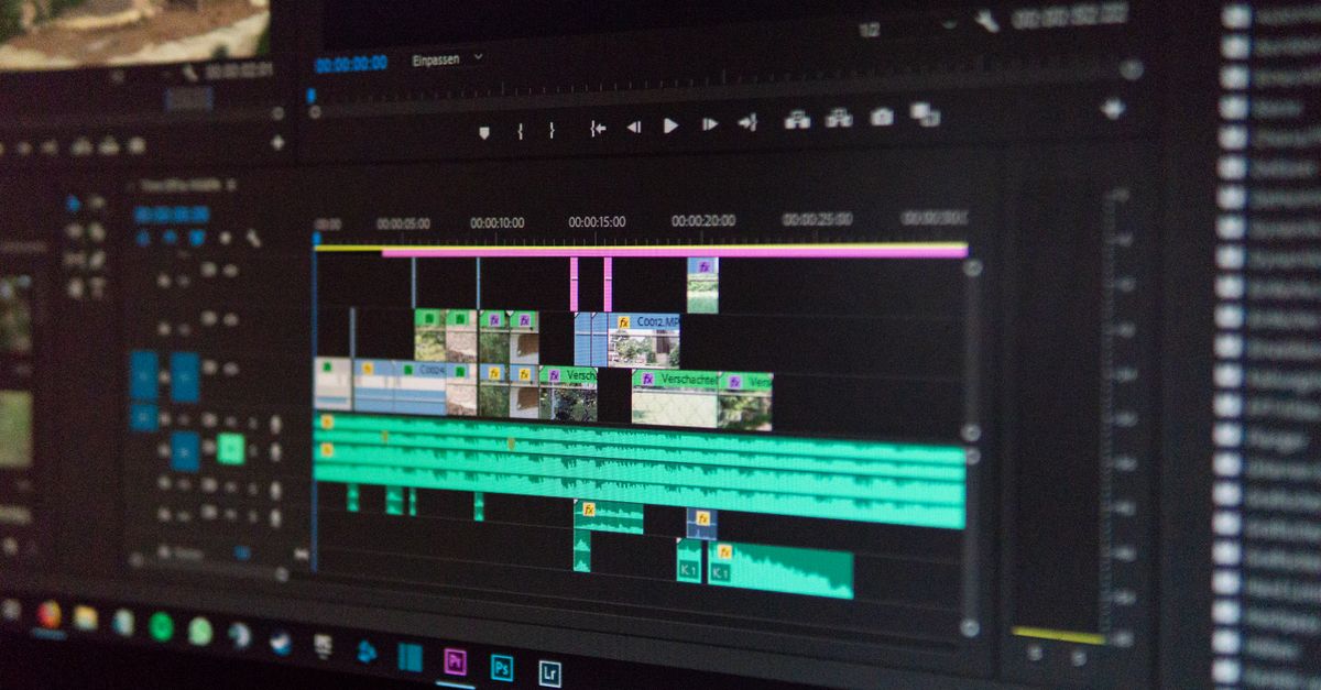
Interawards keeps a consistent editorial surface: warm off-white paper, ink black, one signal orange, and work photographed straight-on rather than styled into a scene. The images below show the kind of material the platform deals with — printed proofs, specimens, screens, studio walls.



Design work disappears fast. A launch ships, a package hits shelves, a title sequence runs once, and then the files sit on a drive somewhere with no shared record of what was made or why it mattered. Interawards is built against that drift.
It is an annual program and an open entry platform at the same time. Independent studios, in-house teams and students all come in through the same door, and every cycle leaves something behind that outlasts the deadline.
Each cycle publishes a searchable archive of shortlisted work with jury notes, category rationale and credits. It is meant to be read years later, not just the week the results land.
The platform is open to studios, in-house teams and students alike. No invitation, no membership tier, no separate track for people who already know someone on the panel.
Entries move through a technical check for file specs, category fit and rights clearance, then scoring by a rotating jury of practicing designers. The same sequence applies across every category.
Warm off-white paper tones, ink black, a single signal orange, a generous grid, work shot straight-on, and a grotesque sans paired with a quiet serif for captions. The look is a position, not decoration.
Studios in Buenos Aires, Santo Domingo and beyond use the program to benchmark work and build a submission record over time. The archive, the calendar of deadlines and the small printed annual are the parts that stay.